Two-tone cabinets look planned when each color has a job and a border. One finish carries the main cabinet runs. The second finish takes a single, complete zone: the island, the base cabinets, or a tall cabinet bank. Test the pair against the floor, the counters, and the light in your own kitchen before you approve it.
Two-tone means two cabinet colors or finishes, and painted fronts paired with wood count. Picking the colors is the easier part. The boundary between them does as much work as the colors themselves.
Start With the Surfaces and Light You Already Have
The floor and counters you are keeping get a say before any paint color does. A honey-toned wood floor can make one gray look muddy and one white look cold, so hold every cabinet sample against it. With a retained countertop, match the stone’s background color. A thin accent vein is no reason to build the whole palette around it.
In a new kitchen, choose the floor, counter, and cabinets as one set. Include the view from the dining or living area, especially where the flooring runs through. Light matters as much as neighbors. A cabinet face beside a window and one tucked under a wall cabinet can read as two different colors in the same paint. Leave the exact shades open until you have seen samples in both spots.
Choose Two Colors With a Clear Relationship
Decide what the pairing is about before you order samples: light against dark, one hue against another, or wood grain against paint. Undertone is the color sitting under a shade, such as the yellow in a cream or the blue in a gray. Warm with warm is the safe route. A cool painted finish can also sit well beside warm wood, as long as the countertop or another shared surface ties them together. Color charts rule out too much. The room is the real test.
White Oak and Off-White
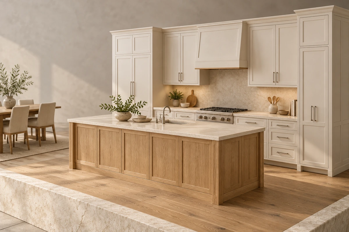
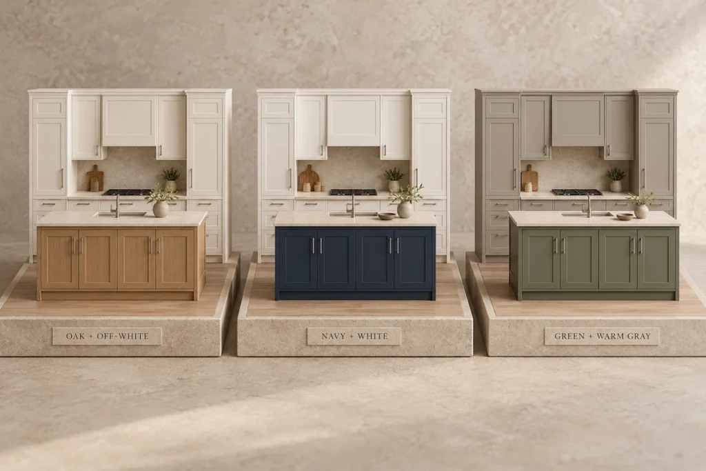
This is the quiet pairing. Oak on the island puts all the grain in one place, and off-white perimeter cabinets give it a calm frame. If the countertop is heavily veined, try a calmer grain so the island and the stone do not compete.
Move the oak to a full-height pantry bank and the kitchen changes character. A whole wall of wood now faces the room. Look at it from the adjoining space before you commit. With white oak kitchen cabinets, the stained sample tells you far more than the species name, so compare it with both the off-white and the floor.
Navy and White
Navy usually sits most comfortably below the counter. On the base cabinets it anchors the room and keeps the dark color away from eye level. Leave the pantry bank white and the horizontal line stays clean. Navy uppers over white bases are the bolder move. Try them only if you want the upper cabinets to be the first thing people see.
For an island-led scheme, wrap the perimeter in white and save the navy for the island. Then put the white beside the countertop. A creamy stone next to a crisp, cool white can look like a mismatch. Keep that contrast only if you meant it. Otherwise, warm up the white.
Muted Green and Warm Gray
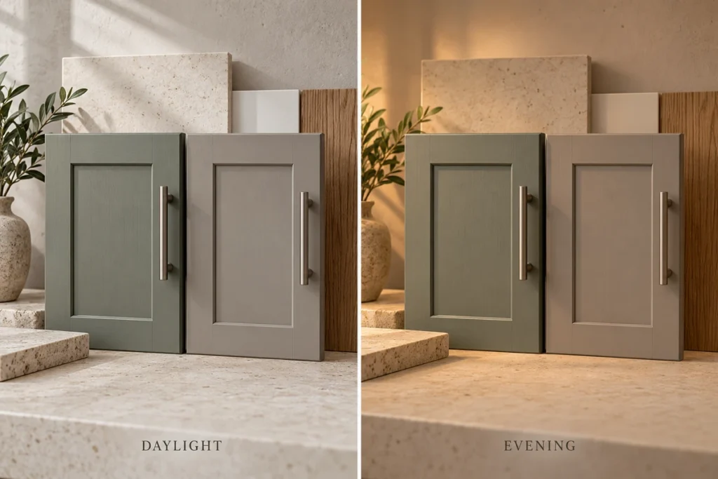
This pairing suits a kitchen where navy and white feel too sharp. A muted green island with warm gray perimeter cabinets separates the two zones without leaning on bright white. Choose two samples that are equally muted. Then make sure they still read as two colors under the room’s lighting, because a pair that sits too close can look like a finishing error.
The gray is the riskier half. Next to green and your retained materials, a gray can drift violet or blue. If it does, try another. A warm floor can work with cooler cabinets, as long as all three samples look deliberate together.
Decide Where Each Cabinet Color Belongs
Placement decides what the second color says. Give it a whole cabinet zone before you experiment with single doors. The same pair can stress a horizontal line, an island, or a vertical bank, and only the location changes.
| Color Placement | What It Emphasizes | What to Check |
|---|---|---|
| Different uppers and lowers | The line between wall and base cabinets | Decide which finish the tall cabinets take. Check where full-height units meet both runs. |
| Different island and perimeter | The island as its own piece within the kitchen | Review every visible island face, including the seating side and end panels. Check how it reads from the dining area. |
| Separate tall cabinet bank | A vertical pantry or appliance wall | Keep the bank in one finish. Include refrigerator panels and exposed sides in the decision. |
Concept diagram: the layout and surfaces stay the same; only the navy cabinet area changes. These illustrative elevations are not measured plans or a completed GEORGE project.
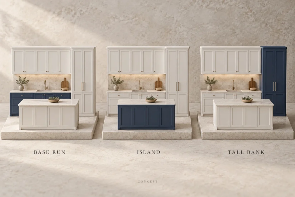
Corners and exposed ends are where a two-tone scheme can start to look unfinished. Follow each color around them. One contrasting door framed by panels in the other color reads very differently from a fully contrasting bank. Mark every boundary on the elevation so the fabricator and installer build what you approved.
Judge the balance from the views you use most: the kitchen entrance and a seat at the dining table. Counting doors will mislead you, because a tall bank and a base run fill very different parts of the view. Set the split by eye, not by a fixed ratio.
Connect the Cabinets to the Rest of the Kitchen
Two cabinet colors need something in common, or they can read as two separate kitchens. A shared surface or a repeated finish provides it. Start with the largest surfaces next to the cabinets, and let smaller details back them up.
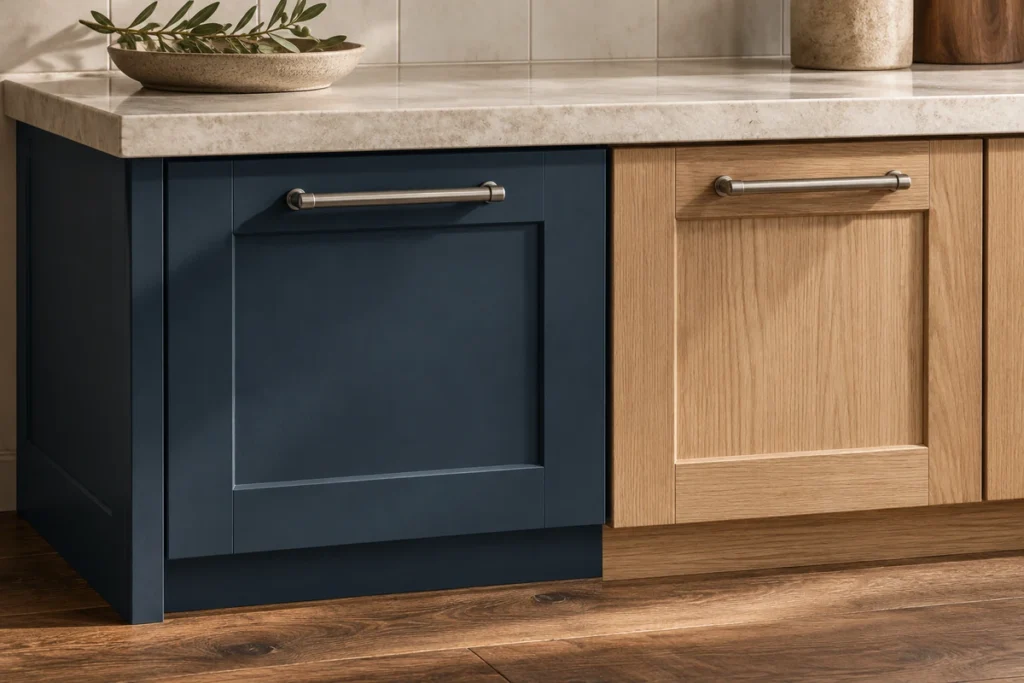
Countertops and Backsplashes
One countertop across the island and the perimeter is the simplest bridge when the cabinets already carry the contrast. Check it against both samples. If the island gets its own counter, give the two counters a visible link, such as a similar background tone. Then check each one against the backsplash.
A strongly veined counter usually wants a quiet backsplash. If patterned tile is meant to be the feature, calm down the counters and the cabinet grain instead. If the countertop is still open, compare countertop types for appearance and care, then test the shortlist against both cabinet finishes.
Flooring and Hardware
Lay the flooring sample under both cabinet finishes. Wood cabinets over a wood floor need a clear decision: a close match or an obvious contrast. The middle ground can look accidental. If you land there, pick a clearly different cabinet tone or move the wood to a smaller area.
Hardware is the easiest thread to run through both colors. One finish across both gives them a shared detail. Hold the real handle against each sample, because a pull that glows on navy can almost vanish on oak. Two hardware finishes can work when the switch follows a clear boundary, such as the island. Alternating them along one run tends to look like a supply problem.
Door Profiles, Grain, and Sheen
Change one thing at a time. If color is the difference you are testing, keep the door profile the same. Change the profile, grain, and color together, and you will not know which one you actually like. If the island needs a different kitchen cabinet style, review it as part of the whole composition.
Sheen shifts how a color reads, so compare the two together. For fluted or deeply profiled fronts, ask for a shaped sample. A flat chip cannot show how the finish settles into recesses and catches on raised faces. Check the grain direction on wood panels too, since a small swatch cannot show a full door’s pattern.
Review the Whole Scheme, Then Confirm Samples
Settle placement first and shades second. Compare color placements in full elevations or 3D views with the layout, materials, lighting, and viewpoint held the same in every option. Once one placement clearly wins, refine the exact colors.
At GEORGE Design Studio, we develop cabinetry as part of the complete interior through 3D design and material coordination. Bring your plans, photos of the materials you are keeping, and your color references. We review cabinet proportions and surrounding finishes together to set a direction for material selection.
A rendering settles placement and proportion. Approve the actual colors from physical samples, because a screen cannot show exactly how a finish will look in your room.
- Place both cabinet samples next to the selected countertop, backsplash, flooring, and hardware.
- Stand the samples upright in the kitchen and view them in daylight and under the lighting you plan to use at night. Benjamin Moore’s How to Use Paint Color Samples recommends movable samples for comparing a color in different locations and light.
- Before approving a factory finish, review a finished door or a representative cabinet sample. Treat a paint chip as a starting reference only.
- Record the color or finish code, sheen, material, sample reference, and cabinet zone for each approved finish.
- Check that the elevations show exposed ends, island panels, tall units, and any appliance fronts meant to match the cabinets.
Start a project discussion with your kitchen plan, photos of existing materials, and the combinations you like. Tell us what you are keeping and which color decisions you want help comparing.
FAQ
Can a Small Kitchen Have Two-Tone Cabinets?
Yes. Put the second finish on one continuous area, such as the base run, rather than scattering it across several small groups. If you want less contrast, compare a close tonal pairing as well. Judge the full elevation from the doorway, since the number of colors alone does not decide whether a small kitchen feels open or crowded.
Can You Use Two Different Wood Finishes?
Yes, as long as the two woods look intended side by side. Compare tone, grain, and how much of each wood is visible, including the floor. If a near-match looks like a mistake, test a clearly lighter or darker second wood. Ask for representative finished samples that show the expected grain variation.
Should Two-Tone Cabinets Continue Into an Adjoining Pantry?
Carry the palette through when the pantry stays in view and should read as part of the kitchen. A pantry behind a door can take its own treatment. Open that door and look before deciding, including at the trim and the transition between the two spaces.