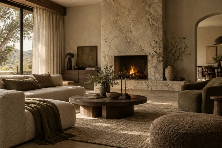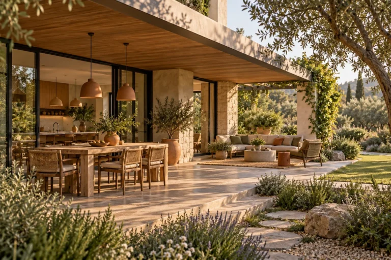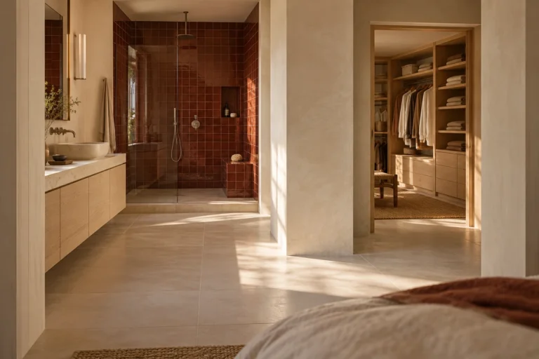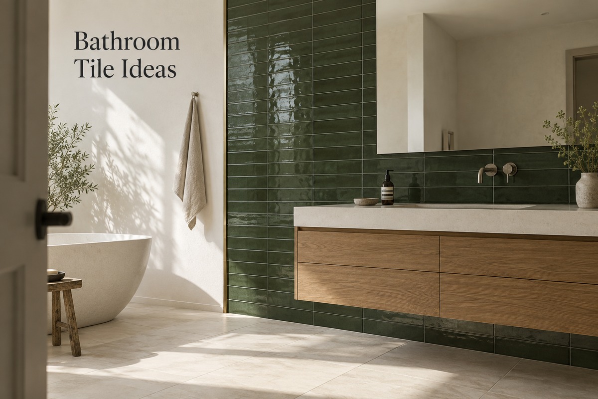
Choosing bathroom wall and floor tiles comes down to two decisions: the overall color palette, and which surface gets the attention. After that, match undertones, pattern intensity, and tile scale. Similar walls and floors make a calm, continuous backdrop; deliberate contrast lets one surface lead.
For a custom home or whole-home renovation, the four combinations below are starting points, each with one Daltile product to sample as a reference. The sections after them show how to test the pairing against your room and turn it into an orderable selection.
Four Wall and Floor Tile Combinations to Consider
Each combination gives one surface the lead and keeps the other in support. The table shows the trade-offs at a glance.
| Combination | What draws the eye | Cabinet and countertop pairing | Watch out for |
| Warm ivory walls + sand-toned floor | Subtle shifts in tone and texture | Light wood or warm painted cabinets; cream countertop | A flat, all-beige room |
| Marble-look walls + neutral floor | Wall veining | Plain cabinet fronts; quiet countertop | Competing veins |
| Patterned floor + white walls | Floor pattern | Simple painted or wood cabinets; solid countertop | Pattern hidden by the vanity and tub |
| Green accent wall + pale floor | One defined area of color | Warm wood or off-white cabinets; pale countertop | An accent with no clear edge |
Warm Ivory Walls and Sand-Toned Floors
Creamy ivory walls over a slightly deeper sand floor sit comfortably beside wood cabinets. Keep the undertones related but vary texture or proportion, such as a rectangular ivory wall tile over a broader, softly mottled floor, or the room goes flat. Hold a cream or warm white countertop against the wall tile, since a cooler white makes ivory look yellow, and in a bathroom with little daylight, test the whole board under the planned lights.
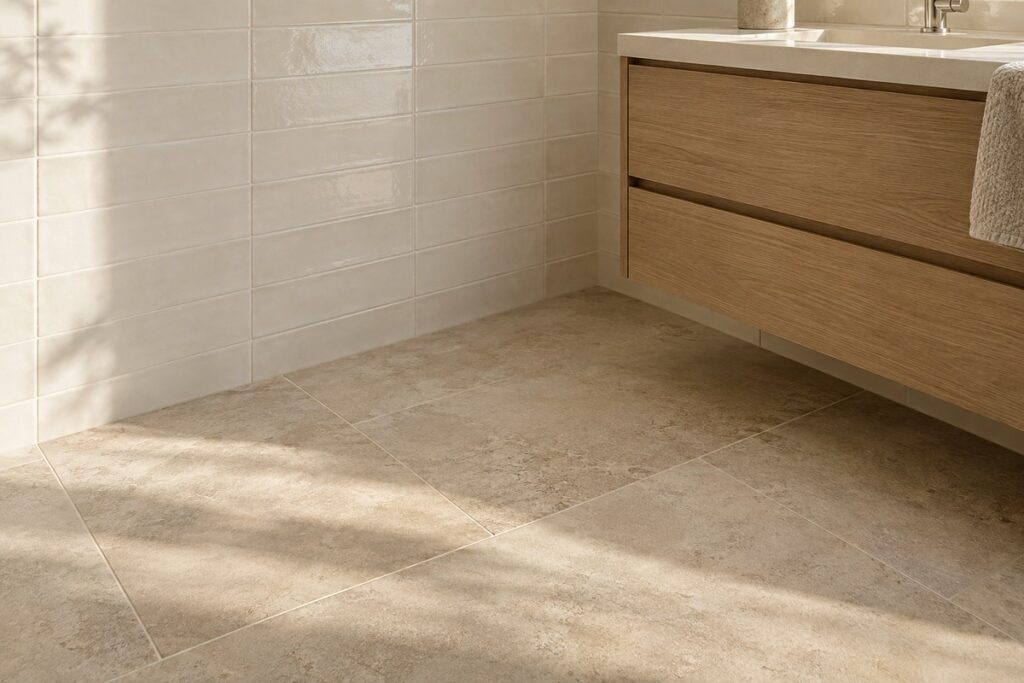
For the floor, Daltile’s Reminiscent in Aged Beige (RM21), a matte, concrete-look 12-by-24-inch tile, is a useful reference. It’s rated for high shade variation, so lay out several full pieces beside the wall sample and cabinet finish before judging the tone.
Marble-Look Walls and Quiet Neutral Floors
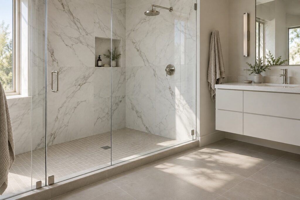
Put marble-look tile on the shower walls or tub surround, with a pale gray, cream, or taupe floor that picks up one tone from the veining. The walls supply movement; the floor gives the eye a rest. Don’t add a second busy stone just because it’s also called marble-look. A plain vanity and quiet countertop keep attention on the walls, and with a double vanity, the cabinets and counter read as one broad band beneath them.
Daltile’s Perpetuo in Brilliant White (PT21) shows the white marble-look direction, but it comes in several sizes and in matte, satin, and polished finishes, so confirm the exact version and approve it from a multi-tile layout. In a narrow shower or around a window, check whether cuts slice through the strongest veins; a quieter tile may suit that wall better.
Patterned Floors and Simple White Walls
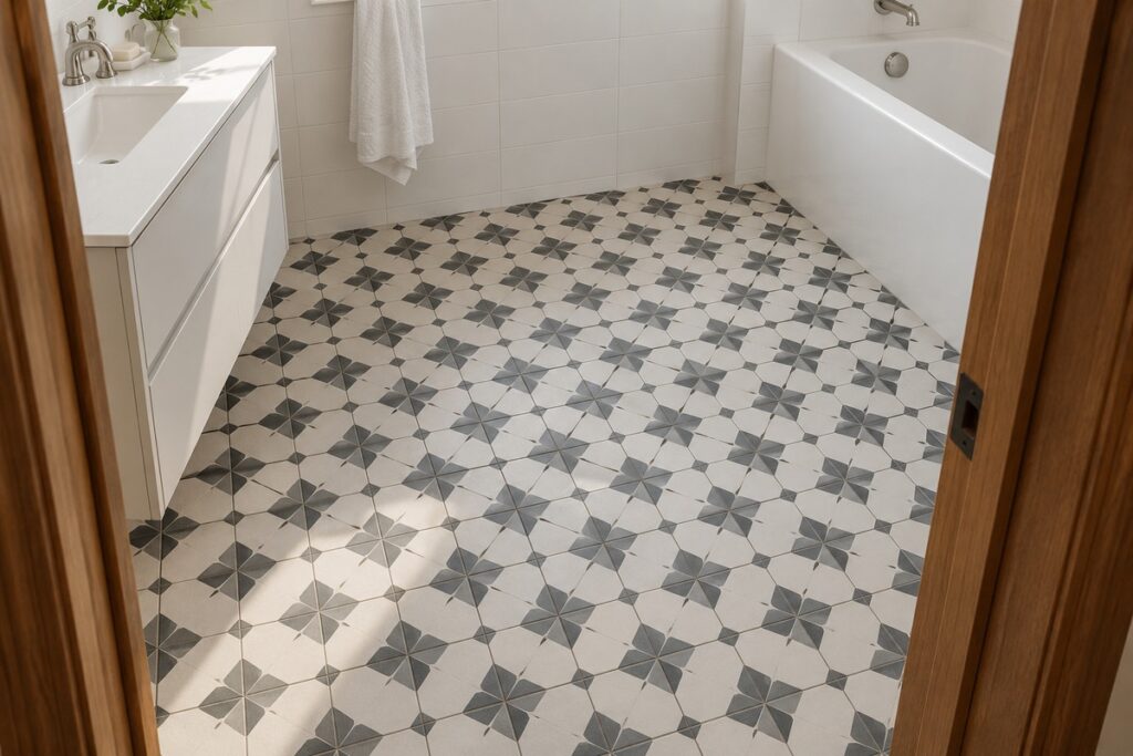
Let a geometric or encaustic-look floor carry the pattern, and take the wall color from the pattern’s lighter background so the two surfaces connect. Plain cabinets and a solid countertop keep the floor the only focal point. In a transitional renovation that keeps existing doors or trim, let their wood tone or paint color guide the cabinet finish.
Preview the repeat on the floor area that will actually show, because a large vanity and tub can leave only fragments of the design; a smaller repeat or simpler pattern may read better. Daltile’s Memoir, a glazed ceramic encaustic-look tile, is a reference for floors and walls but isn’t approved for shower floors, so the shower needs its own product.
Green Accent Walls and Pale Neutral Floors
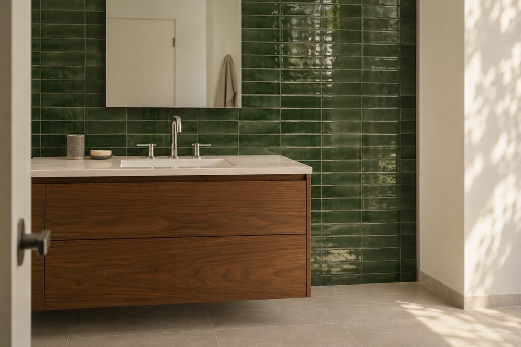
Give green tile one defined surface, such as the shower’s back wall or the wall behind the vanity, and keep the floor pale and neutral so the rest of the room connects to it. Plan the trim pieces where the green stops. Warm wood cabinets add contrast through grain and off-white keeps the room lighter; either way, check a pale countertop’s undertone against the green.
In a small bathroom, look at the accent from the doorway and through the shower glass before deciding one green wall is enough. Daltile’s Color Wheel Classic in Garden Spot (0141), a glossy 3-by-6-inch tile, is a good color reference, but Daltile lists it for walls and backsplashes, not floors, so confirm the specific shower-wall use before specifying it.
Adapt the Combination to Your Bathroom
A combination that works in a showroom still has to fit your walls, cuts, and adjoining rooms. Where the bathroom opens off a bedroom, check the pairing against the home’s residential design direction too; carrying a wood tone or related neutral between the two rooms ties them together.
Checking Tile Scale Against the Room
Compare tile sizes with the real wall widths and visible floor area. A large tile looks composed on an uninterrupted wall and awkward on a short return full of narrow cuts, while a small tile adds joints that become part of the pattern even when the tile is plain.
Review the floor plan with wall elevations that show windows, mirrors, niches, and tile boundaries, and ask for a layout with the perimeter cuts drawn. Small rooms don’t automatically need small tiles, so compare a broad, quiet format and a finer pattern on the same drawing.
Choosing Direction and Pattern Placement
Use orientation to support the surface you want to emphasize: a vertical stack gives a rectangular tile an upward rhythm, and horizontal rows stress its width. Compare both on the actual elevation, including where joints meet the mirror, niche, and wall edges.
Mark where each pattern starts and stops on the drawings, keep the colored wall’s edge clean, and check the veining across the whole shower elevation. If that surface already has strong movement, keep the tub surround simpler.
Carrying Materials Into the Shower and Tub Area
Run the main wall tile into the shower or around the tub when you want those areas to read as one composition. If the shower floor needs a different product, repeat a color from the main floor or walls so the change looks intended. Reminiscent in Aged Beige, for example, also comes as a 2-by-2-inch mosaic, worth asking about for the shower floor once that format’s approval is confirmed.
Treat wall, main-floor, and shower-floor tile as separate selections even when they look identical, and verify each product’s approved location and installation requirements. For slip resistance, check the documented DCOF; ANSI A137.1 requires 0.42 or higher for level interior floors walked on when wet. Daltile notes the number compares products under controlled conditions and doesn’t predict whether someone will slip. A matte finish or small format alone isn’t a specification.
Turn the Preferred Look Into a Product Selection
A good combination can still fall apart at ordering, when a size, finish, or location gets lost between the drawing and the purchase order. We settle the wall-to-floor balance in 3D and confirm color and sheen with tile in hand under the bathroom’s own lights. Within the deliverables agreed for your project, our material selection and specification service logs every approved tile like this:
| Record | What to confirm |
| Product identity | Manufacturer, collection, exact product code, and color |
| Size and surface | Actual dimensions, thickness, finish, and format |
| Location | Main floor, shower floor, shower wall, tub surround, or accent wall |
| Visual approval | Sample reference, pattern layout, grout color, and edge treatment |
| Technical documents | Approved uses, wet-area suitability, care, and installation requirements |
| Drawing reference | Room, elevation, layout, quantities, and approval status |
Give each finish or size its own line, even within one collection, and have quantities checked against the approved drawings, with any accepted substitute logged, before quotation. When your shortlist is ready, start a project with your drawings, tile picks, location, and project stage; supply discussions follow once selections and scope are confirmed.
FAQ
Should Bathroom Floor Tiles Be Darker Than Wall Tiles?
Not necessarily. A darker floor sharpens the line between wall and floor, while similar tones keep the room quieter. Judge it from the doorway, where you see both at once.
How Much Does Grout Change the Look of a Tile Combination?
More than most people expect. Contrasting grout outlines every piece and a close match keeps attention on the surface, so ask for a grouted sample or mockup before approval, especially with small wall tiles or mosaics.
What If the Tile in My Reference Image Is Unavailable?
Find a substitute that plays the same role: background color, pattern intensity, scale, and finish. Compare it with the other approved samples, check its documented uses, and update the drawing and schedule with the new product code before confirming the revised selection or price.